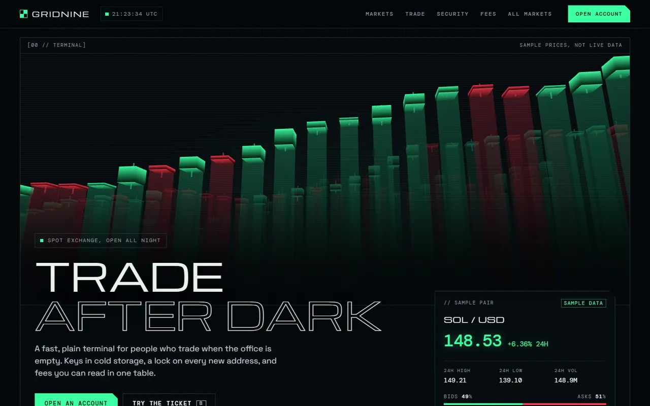
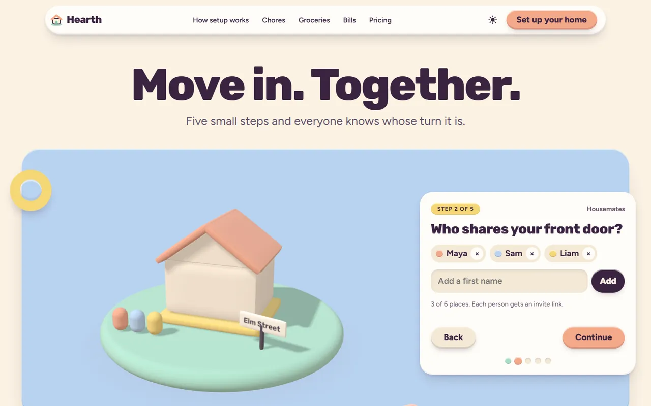
Grid
A Swiss Design conference template.
Grid is a one-track conference site in the Swiss (International Typographic) style: a strict 12-column grid, flush-left grotesk type at poster size, red and black on paper, numbered sections and no divider lines. The sample event, Grid 26, is invented: every name, time, price and figure is sample content.
- For
- Conference / event
- Built with
- HTML, CSS, ES modules, Motion 14.6.0, anime.js 4.5.0 (no build step)
- Pages
- 3 designed pages
- Themes
- Light and dark, following the system, with a switch
Draft listing: this template is finished but still in review before it goes on sale.
Screens from the template



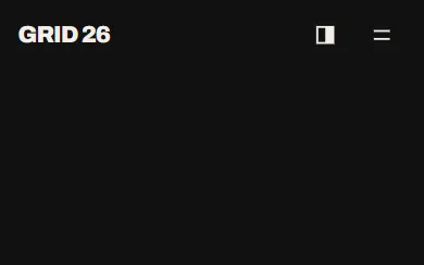
Every page is laid out for a 390 pixel phone as well as for tablet and desktop.
More pages
The 3D moment
The poster sets itself: the 12 grid columns rise, the headline slides up out of its slots, the red date block wipes in and the seat bar fills; press G to lay the grid over any page.
What you get
Straight from the template's README, the same file you will find in the repository.
- Home (
index.html): poster hero with date block, intro and live seat bar; 8 speakers with drawn geometric portraits; two-day timetable; venue with a drawn site plan, building notes and a photo; three ticket tiers; FAQ; contact strip; footer. - Programme (
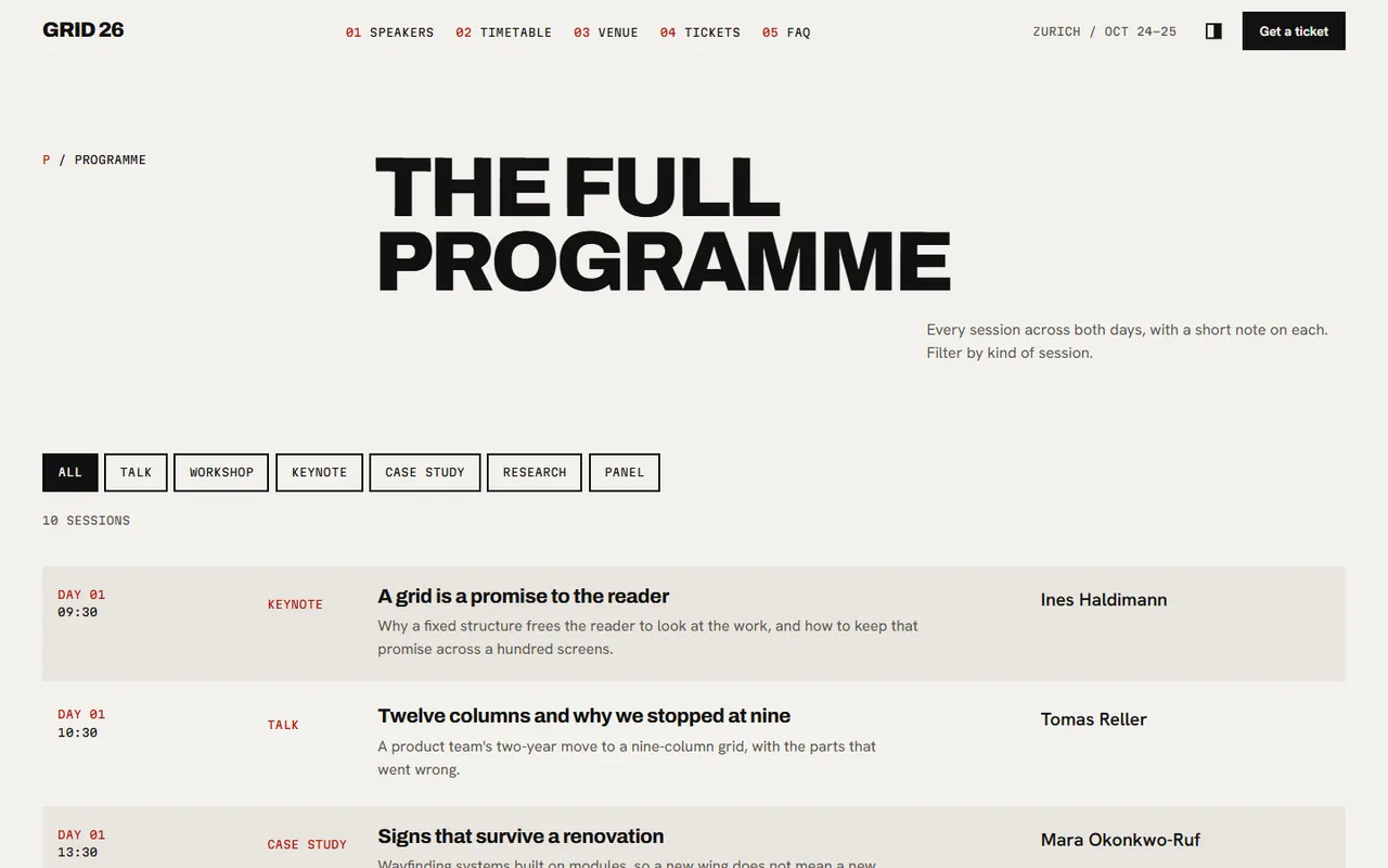
programme.html): every session with a short abstract, filterable by kind of session, with an empty state, plus the code of conduct. - 404 (
404.html). - Light and dark themes (follows the system, with a toggle that remembers the choice), phone to desktop.
- Signature motion: the poster sets itself on load (columns rise, headline lines slide up out of their slots, the date block wipes in, the seat bar fills). Speaker portraits assemble as they arrive and shift apart on hover. Press G (or "Show the grid" in the footer) to lay the 12 columns over any page.
- Reduced motion: everything appears in its final place, no travel.
Pages and stack
Every page below is designed and built, in both themes, at phone, tablet and desktop sizes.
Pages
- Home
- Programme
- 404
Stack
- HTML
- CSS
- ES modules
- Motion 14.6.0
- anime.js 4.5.0 (no build step)
The licence, in short
One purchase covers every site you build. Read the whole licence
You can
- Build as many websites and web apps with it as you like, for yourself or for clients.
- Change anything: code, design, copy, colours and layout.
- Charge clients for the work and hand them the finished site with its source code.
You cannot
- Sell, give away or publish the template itself, changed or not, as a template, theme, starter, kit or design file.
- Use it in a product whose main purpose is letting others build sites, like a site builder or theme marketplace.